Continuing on from the previous post, this entry will describe a workflow for saving the satellite image mosaic created using Google Earth Engine to an RGB raster file. The image will then be processed to scale its values, and tiled for use as a web map layer.
Exporting the Image
After running the GEE script from the last post, prepare a layer for export by selecting bands from the rgb layer and sorting them in RGB format (i.e. bands 4, 3, 2). The resulting RGB layer can then be exported to a GeoTiff (requires Google Drive with sufficient storage available) by additionally running the code below and then clicking Run > Set Output in the Tasks panel. Note that the export may take quite a long time to run (in my case 39 mins), but once started the GEE editor can be closed. For starting in a fresh editor session, a full script is available here, which skips the visualization and other unneeded elements of the original script, and then runs the export.
// Reorder bands to correct 'True Color' RGB ordering.
var sentinel2mosaic = rgb.select('B4_median').rename('b4')
  .addBands(rgb.select('B3_median').rename('b3'))
  .addBands(rgb.select('B2_median').rename('b2'));

// Export the image, specifying the CRS, scale, and region.
Export.image.toDrive({
  image: sentinel2mosaic,
  description: 'sentinel2mosaic',
  crs: 'EPSG:4326',
  //crsTransform: affine,
  region: geom,
  scale: 10
});
Processing
One the export is complete, the file can be downloaded from Google Drive and processed. The intent is to tile the image using gdal2tiles, but if we check the data type of the file with gdalinfo as gdalinfo sentinel2mosaic.tif -mm, we can see the values are stored as a Float64 data type, whereas the gdal2tilesdocumentation states the following:
Inputs with non-Byte data type (i.e. Int16, UInt16,…) will be clamped to the Byte data type, causing wrong results. To avoid this it is necessary to rescale input to the Byte data type using gdal_translate utility.
This means before we can tile the image, we first need to convert the data type from Float64 to Byte, and scale the 64 bit values to fit within this greatly reduced range (0-255). As recommended above, we can usegdal_translate for this as:
Although if you then open the resulting file in QGIS, you will likely see that the image appears very dark:
To fix this, right click on the layer and select Properties > Symbology, and under Min / Max Value Settings, set Cumulative count cut, and Contrast enhancement as Stretch to MinMax, then hit Apply:
What happened here was the extreme top and bottom 2% of values were excluded from the color ramp, which were otherwise setting a too large range that allocates unexpected colors to the majority of values. This fix only applies to the layer in QGIS, however, so to fix the file itself, we too need to exclude the top and bottom 2% of values when scaling. One way to get these values can be with a simple Python script as below:
python3
import gdal
import numpy as np

ds = gdal.Open('sentinel2mosaic.tif')
for n in range(1, 4):
    band = ds.GetRasterBand(n)
    arr = band.ReadAsArray()
    sel = np.isnan(arr)
    p2 = np.percentile(arr[~sel], 2)
    p98 = np.percentile(arr[~sel], 98)
    print('{}: {} {}'.format(n, p2, p98))
Which returns the values:
1: 147.5 1341.0
2: 292.5 1184.0
3: 268.0 955.0
We can then re-run the scaling and override the default min-max values with the 2nd and 98th percentiles calculated above as:
I usually download, store, and process data on my own local machines, archiving the raw data, possibly ingesting it to a database, and then writing scripts for further processing and analysis. This approach can quickly become problematic for particularly large datasets, however, due to limits on available disk space for storage or network speeds for downloading, or insufficient cpu power and memory capacity for effective processing. Rather than investing in additional computing resources, one solution to this kind of problem is Google Earth Engine, a web service that can do this kind of processing for you for free, with ready access to a wide range of data sources.
One such use case is to create a cloud free satellite image mosaic from a time series of satellite imagery. Assembling this yourself would require the download of a potentially large number of images, and writing an algorithm to filter and combine them in memory, likely requiring significant computing resources.
Here, I will demonstrate using Google Earth Engine (GEE) to assemble a filtered time series of satellite image tiles from the Copernicus Sentinel-2 mission, then mask cloud cover, and mosaic (merge) them into a single high resolution RGB image. To get started with GEE, sign up for a free account at: https://signup.earthengine.google.com/ and open the code editor at: https://code.earthengine.google.com.
The GEE code editor is a web based IDE, including a text editor to write and run scripts, a console to display information and errors, an interactive map to visualize results, and built in access to examples and documentation. GEE code is written in JavaScript, utilizing a library with a variety of special functions for image processing (prefixed with ee).
Count Tiles
First, we need to choose a location for the time series, and a date range that has sufficient non-cloudy tiles (<10% cloud cover) for creating the mosaic image. From some trial and error, I found July-September 2021 to be such a time period for my selected area of Prince Edward County, Ontario.
To replicate, add the below code to your new script (the center panel) and click Run. This will load in a time series of Sentinel imagery based on the specified date, location and cloud cover filters, check how many tiles were returned, and finally visualize the results in the map panel.
// Define parameters for run: date range, extent, projection, and map location.
var minDate = ee.Date('2021-07-01');
var maxDate = ee.Date('2021-09-30');
var geom = ee.Geometry.Rectangle([-77.70, 43.82, -76.79, 44.2]);
var affine = [0.00026949458523585647, 0, -180, 0, -0.00026949458523585647, 86.0000269494563];
Map.setCenter(-77.2, 44.0, 10);

// Read the Copernicus Sentinel 2 collection, and filter by date, bounds, and cloud cover, then select the bands of interest.
var s2Sr = ee.ImageCollection('COPERNICUS/S2_SR')
    .filterDate(minDate, maxDate)
    .filterBounds(geom)
    .filter(ee.Filter.lt('CLOUDY_PIXEL_PERCENTAGE', 10))
    .select(['B2', 'B3', 'B4', 'B5', 'QA60']);

// Create an image with the tile overlap count per pixel from a reference band, and clip to geom.
var count = s2Sr.select(['B2']).count().clip(geom);

// Get the min max range of the image.
var minMax = count.reduceRegion({
    reducer: ee.Reducer.minMax(),
    geometry: geom,
    crs: 'EPSG:4326',
    crsTransform: affine
  });
var min = minMax.get('B2_min').getInfo();
var max = minMax.get('B2_max').getInfo();

// Visualize the layer on the map.
var countViz = {
  min: min,
  max: max
};
Map.addLayer(
  count,
  countViz,
  'count'
);
Add a Legend
Although the map values are color coded, exactly what it shows is unclear without a legend. To add a legend to the map, additionally run the below code, defining a function for generating a legend and then applying it to the counts layer. There should be no less than three images present in any given location with these filters, which is enough to remove the clouds without leaving gaps in this case.
function addContinuousLegend(viz, title) {

  // Create legend title.
  var legendTitle = ui.Label({
    value: title,
    style: {
      fontWeight: 'bold',
      fontSize: '18px',
      margin: '0 0 2px 0',
      padding: '0'
    }
  });

  // Create the legend color ramp image.
  var lon = ee.Image.pixelLonLat().select('latitude');
  var gradient = lon.multiply((viz.max-viz.min)/100.0).add(viz.min);
  var legendImage = gradient.visualize(viz);

  // Create a thumbnail from the image.
  var thumbnail = ui.Thumbnail({
    image: legendImage,
    params: {bbox:'0,0,10,100', dimensions:'10x200'},
    style: {padding: '1px', position: 'bottom-center'}
  });

  // Create legend with title, min-max values, and color ramp bar.
  var legend = ui.Panel({
    widgets: [
      legendTitle,
      ui.Label(viz['max']),
      thumbnail,
      ui.Label(viz['min'])
    ],
    style: {
      position: 'bottom-right',
      padding: '10px 10px'
    }
  });

  // Add legend to current map.
  Map.add(legend);
}

addContinuousLegend(
  countViz,
  'count'
);
Tile counts per pixel
Identify Cloudy Pixels
There are a couple of examples of applying a cloud reduction algorithm to Sentinel 2 imagery provided by Google here and here. Below, I have combined and refined the two to create a mask layer with the locations of cloudy pixels. This is then overlaid on the map to show areas where at least one of the tiles is determined to have clouds present.
// Join two collections on their 'system:index' property.
// The propertyName parameter is the name of the property
// that references the joined image.
// Function taken from: https://code.earthengine.google.com/?scriptPath=Examples%3ACloud%20Masking%2FSentinel2%20Cloud%20And%20Shadow
function indexJoin(collectionA, collectionB, propertyName) {
  var joined = ee.ImageCollection(ee.Join.saveFirst(propertyName).apply({
    primary: collectionA,
    secondary: collectionB,
    condition: ee.Filter.equals({
      leftField: 'system:index',
      rightField: 'system:index'})
  }));

  // Merge the bands of the joined image.
  return joined.map(function(image) {
    return image.addBands(ee.Image(image.get(propertyName)));
  });
}

// Cloud detection algorithm, combined from functions at:
// https://code.earthengine.google.com/?scriptPath=Examples%3ACloud%20Masking%2FSentinel2%20Cloud%20And%20Shadow
// and
// https://code.earthengine.google.com/?scriptPath=Examples%3ADatasets%2FCOPERNICUS_S2
function getCloudsMask(image) {
  var cdi = ee.Algorithms.Sentinel2.CDI(image);
  var cloudProb = image.select('probability');
  var cirrus = image.select('B10').multiply(0.0001);
  var qa = image.select('QA60');

  // Bits 10 and 11 are clouds and cirrus, respectively.
  var cloudBitMask = 1 << 10;
  var cirrusBitMask = 1 << 11;

  // Combine cloud cover layers to create a mask.
  var mask =
    (
      qa.bitwiseAnd(cloudBitMask).gt(0)
      .or(qa.bitwiseAnd(cirrusBitMask).gt(0))
    ).or(
      cloudProb.gt(65).and(cdi.lt(-0.5))
    ).or(
      cirrus.gt(0.01)
    );
  return mask;
}

// Read additional image collections for cloud detection.
var s2 = ee.ImageCollection('COPERNICUS/S2')
    .filterDate(minDate, maxDate)
    .filterBounds(geom)
    .select(['B7', 'B8', 'B8A', 'B10']);
var s2Clouds = ee.ImageCollection('COPERNICUS/S2_CLOUD_PROBABILITY')
    .filterDate(minDate, maxDate)
    .filterBounds(geom);

// Join the cloud probability dataset to surface reflectance.
var withCloudProbability = indexJoin(s2Sr, s2Clouds, 'cloud_probability');

// Join the L1C data to get the bands needed for CDI.
var dataset = indexJoin(withCloudProbability, s2, 'l1c');

// Apply the cloud masking algorithm to create an image mask.
var clouds = dataset.map(getCloudsMask);

// Mask and clip the layer.
var totClouds = clouds.sum().gt(0).selfMask().clip(geom);

// Visualize the layer on the map.
var cloudsViz = {
  min: 1,
  max: 1,
  palette: 'red'
};
Map.addLayer(totClouds, cloudsViz, 'clouds');
Pixels with clouds
Remove Clouds
With the clouds mask, it is now a case of removing those pixels from the affected tiles, and finally taking an average (median) of what remains the create a cloud free mosaic. To visualize the results, a SplitPanel can be used to place two maps side by side, with a slider to switch the display between them, to see the areas where clouds have been removed, as below.
// Select RGB bands, and join clouds mask.
var withCloudMask = indexJoin(dataset.select(['B2', 'B3', 'B4']), clouds, 'QA60');

// Make another map to display the output layer.
var linkedMap = ui.Map();

// Map the cloud masking function over the joined collection.
var masked = ee.ImageCollection(withCloudMask.map(function(img) {
  return img.updateMask(img.select('QA60').eq(0));
}));

// Take the median values across the timeseries, specifying a tileScale to avoid memory errors.
var median = masked.reduce(ee.Reducer.median(), 8);

// Crop layer to target geometry.
var rgb = median.clip(geom);

// Add the layer to the second map.
var viz = {
  bands: ['B4_median', 'B3_median', 'B2_median'],
  min: 0,
  max: 3000
};
linkedMap.addLayer(rgb, viz, 'median');

// Link the default Map to the second map.
var linker = ui.Map.Linker([ui.root.widgets().get(0), linkedMap]);

// Create a SplitPanel which holds the linked maps side-by-side.
var splitPanel = ui.SplitPanel({
  firstPanel: linker.get(0),
  secondPanel: linker.get(1),
  orientation: 'horizontal',
  wipe: true,
  style: {stretch: 'both'}
});

// Set the SplitPanel as the only thing in root.
ui.root.widgets().reset([splitPanel]);
Cloud “free” satellite image
The full and final script for all these steps can be accessed here.
Elevation map of Ontario, lighter shades are higher elevations.
Digital Elevation Models (DEMs) are maps of the bare topographic surface of the Earth, excluding features like trees and buildings etc, and usually collected by satellites. DEMs can be used to map topographic elevation, relief, slope, and aspect, and are useful sources for a range of purposes such as flood risk modelling, contour mapping, correcting aerial and satellite imagery, and land cover classification.
A well known source of this data is the USGS/NASA Shuttle Radar Topography Mission (SRTM), which provides tiled DEM data for the entire globe within latitudes 60° N and 56° S, at a resolution of 1 arc-second (~30m).
In this post, I describe some methods to source and process SRTM imagery. Before you can download the data though, you’ll first need to register for a free Earthdata account.
PEC Sample DEM
As an example, we can first create an elevation map for a smaller region, in this case Prince Edward County, Ontario (the peninsular in north eastern lake Ontario). For downloading a handful of tiles, this useful tool created by Derek Watkins can be used to select tiles from an interactive map: http://dwtkns.com/srtm30m/.
Download and unzip the four tiles that cover Prince Edward County, N44W078 (pictured below) and the three others east and south of it: N44W077; N43W077; and N43W078, entering your Earthdata username and password when prompted. Also, download Canadian census divisions data from Statistics Canada (Cartographic Boundary File), which we can use to clip the SRTM data.
SRTM download by tile
With the four tiles downloaded and unzipped to .hgt files, we can merge them using GDAL, building a VRT file, a virtual dataset useful for intermediate processing steps. The below example uses Docker and the osgeo/gdal image, but can be modified for other configurations.
We can then clip the VRT file to the census divisions layer with gdalwarp as below, selecting the ‘Prince Edward’ feature as a cutline. This creates a clipped DEM GeoTiff like that displayed at the head of this post.
Some alternative calculations and visualizations can be created with the gdaldem tool as below, for example hillshade (shaded relief to represent 3d terrain), slope, and aspect (the direction of the slope).
Needless to say, it would be tedious and time consuming to manually download individual tiles to cover the entirety of Ontario (or beyond) in this way. So to scale up to a larger area we can write a script to automate the process using e.g. Python, like shown in the notebook below (available for download here).
This script uses a layer of the SRTM grid extent and a Provinces/territories boundaries layer, again from Statistics Canada, overlaying the two to determine which tiles to download. Note that the entire selection consists of 170 files, totalling ~750mb, which make take some time to download.
With the tiles downloaded we can again use GDAL to merge and crop the tiles in a similar way to the PEC sample e.g.
I you want to use the results for a web map, web tiles can be created using gdal2tiles.py, after first converting the data type via gdal_translate. The below commands generate web map tiles at zoom levels 4-10, along with the HTML content for rendering a web map, such as leaflet.
Posts so far in this blog have focused on creating web maps with vector tiles i.e. maps made up of point, line, and polygon geometries, rendered client side in a browser. Alternatively, a web map can be pre-rendered and served using raster tiles (i.e. images), as is often done by many web map providers, including OpenStreetMap (OSM).
Raster tiles can be a good choice for a basemap when the styling is intended to be static i.e. rarely updated, and non-interactive. They can potentially allow for a greater level of detail, as being pre-rendered, they are not affected by the geometry simplification or feature limits required by vector tiles for client side rendering.
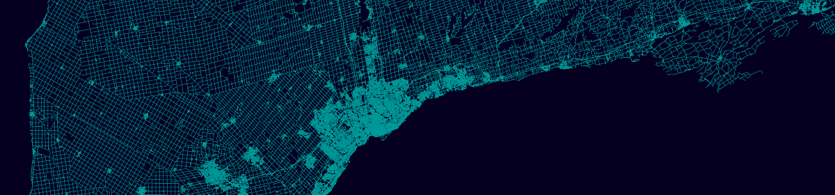
This post details a workflow for creating a custom styled OSM raster map of Ontario, utilizing elements of the openmaptiles stack for data processing, and tilemill for map styling, replicating the basemap below:
OSM import
To get started, first download the ontario-latest OSM database from geofabrik in .osm.pbf format. The PBF format used by OSM is highly compressed and contains many, many tags (attributes), and so requires processing to extract the features and attributes of interest. In this case we will use Imposm to filter and transform the PBF file to a PostGIS spatial database.
Next, download an example of the mapping file that Imposm will use to filter the OSM layers and tags and create database tables. Save this to the same directory as the OSM PBF file and then run the import container. Note that on my machine, this process took around an hour to complete.
Once the import has completed, we can start a tilemill container for designing the map as below. You then connect to the tilemill interface in a browser at localhost:20009, although it may take a few minutes before you can connect, while the app starts up.
Within the tilemill app, select New project, and enter a suitable Filename and Name for the project, and optionally a Description, then click Add to start the project.
A default countries layer is included with the map style, which we will extend with some of the layers imported to our OSM database. To do so, click the layers icon and select Add Layer. In this form, we will enter the connection details for your database, and specify the SQL for selecting the target layer and columns, for example the osm_waterareas_gen0 layer:
Breaking this down, this form should be completed with the following main details:
ID: The unique name to refer to the layer for styling e.g. osm-waterareas-gen0
Connection: The connection string for your database e.g. host=database container ip dbname=osm user=mapping-on password=mapping-on port=5432
Table or subquery: The SQL query e.g. select st_area(geometry) as area, geometry from osm_waterareas_gen0 where type in (‘water’, ‘reservoir’)
To get your Docker database container ip address to use for the connection string host parameter, enter the below command in a terminal and look for the “IPv4Address” for your “osm-db” container. The host is this value, excluding the slash and anything after it.
docker network inspect bridge
Once complete, click Save, and then repeat the process for the remaining layers, using the same connection string, but setting the ID and SQL queries as per the table below. This will add layers for water polygons (waterareas), waterways, and roads at three different levels of detail, plus layers with administration boundaries and place names.
ID
Table or subquery
osm-waterareas-gen1
select geometry from osm_waterareas_gen1 where type in (‘water’, ‘reservoir’)
osm-waterareas
select geometry from osm_waterareas where type in (‘water’, ‘reservoir’)
osm-waterways-gen0
select geometry from osm_waterways_gen0
osm-waterways-gen1
select geometry from osm_waterways_gen1
osm-waterways
select geometry from osm_waterways
osm-roads
select type, geometry from osm_roads where type in (‘motorway’, ‘tertiary’, ‘trunk’, ‘tertiary_link’, ‘motorway_link’, ‘secondary_link’, ‘primary_link’, ‘trunk_link’, ‘road’, ‘secondary’, ‘primary’)
osm-roads-gen0
select type, geometry from osm_roads_gen0 where type in (‘motorway’, ‘tertiary’, ‘trunk’, ‘tertiary_link’, ‘motorway_link’, ‘secondary_link’, ‘primary_link’, ‘trunk_link’, ‘road’, ‘secondary’, ‘primary’)
osm-roads-gen1
select type, geometry from osm_roads_gen1 where type in (‘motorway’, ‘tertiary’, ‘trunk’, ‘tertiary_link’, ‘motorway_link’, ‘secondary_link’, ‘primary_link’, ‘trunk_link’, ‘road’, ‘secondary’, ‘primary’)
osm-roads
select type, geometry from osm_roads where type in (‘motorway’, ‘tertiary’, ‘trunk’, ‘tertiary_link’, ‘motorway_link’, ‘secondary_link’, ‘primary_link’, ‘trunk_link’, ‘road’, ‘secondary’, ‘primary’)
osm-admin
select geometry from osm_admin where admin_level = 4
osm-places
select name, type, population, geometry from osm_places where type in (‘town’, ‘city’, ‘village’) order by population desc
Styling
With all layers added to the map, it is time to style them by editing the style.mss file in the editor on the right side of the app, copying and pasting the styling for each layer from the example below.
The styling language used for Tilemill is CartoCSS, which although outside the scope of this post to review in full, some features used in the style include:
Referring to named parameters with @, here used to store and retrieve colour values.
A “symbolizer” is defined with #, followed by the layer name and a pair of curly braces {}, within which are the styling details.
Filtering for each individual symbolizer can be set with square braces [], which can include map parameters like zoom level, and layer column values like type.
Styling is defined by providing values for various parameters, controlling things like colour, size, and text.
Export and serve
To export the map to raster tiles, select Export in the upper right of the application and choose MBTiles. In the export menu, set the Zoom levels to 5-13 and enter -96.41,-73.57 as the map Bounds to limit the number of tiles created, specify a Filename, then click Export, and once completed (which may take a while), save the mbtiles file locally.
The raster tiles can then be served with tileserver in a similar way to vector tiles in past posts e.g., in a terminal with the raster tiles saved in the current working directory, run a command like below.
docker run --rm -it -v $(pwd):/data -p 80:80 klokantech/tileserver-gl
Note that the tileserver app UI doesn’t present the correct urls, but the data is still being served, in this case the tiles url is at: http://localhost:80/data/osm-on/{z}/{x}/{y}.png8. An alternative could be to export the raster tiles to png files within directories with mbutil, which could then be served with nginx or similar.
A popular method for mapping census data is the “dot” density map, a method to randomly distribute values (often population counts) throughout geographic zones to visualize the variation in density across the zones. A well known example of such a map is The University of Virginia’s Racial Dot Map.
I recently posted my own version of a dot map, using Statistics Canada 2016 census data to map the speakers of Canada’s official languages of English and French (or both). This post details a similar method for creating a dot map table, implemented in Python 3 with libraries pandas and geopandas, and ran in an jupyter notebook as embedded below.
To run the code, download dissemination areas (Cartographic Boundary File) to use as the geographic zones, and a matching data table from the 2016 census – in this case table 26.1 from the Language topic. Then copy the code snippets, or alternatively download the notebook from here, update the file paths, and run.
With the census values distributed throughout the country, the resulting csv file can be loaded into QGIS and symbolized by language as below, here where red equals English, blue French, and green bilingual speakers.
The patterns in overall population density are clear, with the highest density regions found in southern Ontario and Québec, and major cities like Vancouver, Calgary, Edmonton, and Winnipeg.
Official language speakers are shown to be primarily English across most provinces, transitioning to bilingual closer to the Québec border, the province where French speakers are most common. The largest densities of bilingual speakers can be seen in cosmopolitan cities like Ottawa, Montréal, and Québec city.
I have just posted a new map I’ve been working on for some time, a “dot map” showing the population distribution of official languages (English, French, or Bilingual) throughout Canada, uploaded here, and embedded below.
Inspired by The Racial Dot Map by the University of Virginia, the language map displays one dot per official language speaker reported by the Statistics Canada 2016 Census of Population. English speakers are coloured red, French in blue, and bilingual speakers green. As dots are semi-transparent, where languages overlap purples or browns may be visible.
The map was developed by randomly distributing the dots within dissemination areas, with a weighting towards building locations. MBTiles were then generated from the results with tippecanoe and displayed with Mapbox GL JS.
This is the final entry in my three part series detailing the creation of a vector map from scratch. This post covers displaying the vector tiles created in part 1 with the styling of part 2, in a JavaScript web map, here using Mapbox GL JS.
If not already active, first start a localhost instance of tileserver-gl to serve the style from part 2, by running the below command in a terminal within the directory containing the server files – config.json; road.mbtiles; and the style file.
docker run --rm -it -v $PWD:/data -p 80:80 klokantech/tileserver-gl
Connect to tileserver at localhost, and make a note of the url for the style.json listed under GL Style e.g. http://localhost/styles/road/style.json. This is the endpoint of our styled tiles, and what is needed to display them in a web map.
For the web map, I am using Mapbox’s GL JavaScript library, probably the most fully featured and simple solution for displaying vector tiles. To start, take the simple map example and copy this to a text file named index.html like below.
<!DOCTYPE html>
<html>
<head>
<meta charset="utf-8" />
<title>Display a map</title>
<meta name="viewport" content="initial-scale=1,maximum-scale=1,user-scalable=no" />
<script src="https://api.mapbox.com/mapbox-gl-js/v1.11.0/mapbox-gl.js"></script>
<link href="https://api.mapbox.com/mapbox-gl-js/v1.11.0/mapbox-gl.css" rel="stylesheet" />
<style>
    body { margin: 0; padding: 0; }
    #map { position: absolute; top: 0; bottom: 0; width: 100%; }
</style>
</head>
<body>
<div id="map"></div>
<script>
    // TO MAKE THE MAP APPEAR YOU MUST
    // ADD YOUR ACCESS TOKEN FROM
    // https://account.mapbox.com
    mapboxgl.accessToken = '<your access token here>';
    var map = new mapboxgl.Map({
        container: 'map', // container id
        style: 'mapbox://styles/mapbox/streets-v11', // stylesheet location
        center: [-74.5, 40], // starting position [lng, lat]
        zoom: 9 // starting zoom
    });
</script>

</body>
</html>
Then, simply edit the map object to refer to our own style url from tileserver-gl – the mapbox token can also be removed, this is not required when using non-Mapbox styles. So, replace the lines within the <script> tags with something like:
This also updates the default map view with the zoom and center parameters to display Ontario when connecting to the map, and limits in min and max zoom levels to match the zoom levels present in the tiles. We can also add a control with map.addControl, in this case zoom and rotation controls.
Opening index.html in a browser should give you something like below – a fully functioning web map, running off of tileserver-gl.
Resuming from part 1, this post continues in outlining the steps for developing a roads web map, next discussing styling vector tiles with maputnik.
First, start a tileserver-gl instance on localhost with the roads.mbtiles database from part 1, using the –verbose parameter to display the configuration options, which we can use later:
docker run --rm -it -v $PWD:/data -p 80:80 klokantech/tileserver-gl --verbose
Next, access the tileserver frontend via a browser by connecting to localhost:8080, and click the TileJSON button to obtain a url for the served data – something like: http://localhost/data/road.json. Make note of this url.
To style the data, we can use the maputnik editor, also available to run locally via Docker, as below. Note that a previous edit of this post used the online editor, but this now blocks HTTP requests (i.e. our localhost data source) due to CORS. If we also run maputnik on localhost, this gets around the problem.
docker run --rm -it -p 8888:8888 maputnik/editor
Connect to the app at http://localhost:8888/, which will likely display a default example style, so first clear this by selecting Openfrom the header, and from the gallery options, Empty Style. Next, set a name and owner for the new style under the Style Settings tab.
We can now add our server data from the Data Sources tab, under Add New Source. To do this, set the source type to TileJSON, the url to your localhost url from earlier, choose a suitable ID, then hit Add Source.
The next step is to add that layer to the style with the Add Layer button of the Layers pane. Set the source ID from above, the name of the layer to style, and a layer ID (here all are simply “road”), and set the (geometry) type to line, then click Add Layer.
Note that the roads layer may be outside the current map bounds and not immediately visible, so browse to http://localhost:8888/#4/50/-80 to center the map on Ontario, where if all is well, the roads layer should be visible, with default styling options applied.
We can customize the styling of the roads layer with various options in the layers panel. For example, adjusting the min and max zoom levels the layer is displayed, the color, and the width, as below. Here, I’ve set the width to vary by zoom level, to improve visualization. This can be done by clicking the epsilon button and setting min/max values for the range: 0.1 px at zoom level 4 to 1 px at zoom levels 10+.
Also add a background layer with the same Add Layer control, and set a suitable fill color under Paint properties. Make sure to drag the new layer below roads in the layer panel, otherwise it will be drawn above it.
With this basic style complete, hit the Export button, and download the style as a JSON file. We can now create a config JSON file for tileserver-gl to use the style, based on the default config that is displayed by the –verbose option of the earlier tileserver-gl run. Create something like the below with a text editor, changing the “style” and “mbtiles” paths as needed. Save this in the same directory as your .mbtiles file as config.json.
Restart the tileserver-gl instance to read from the new config file, and again connect to the app at localhost. Click Viewer to generate a sample map, and check that your style file has been applied.
The next and final step will be to display the same styled vector tiles in a web map outside of tileserver, the topic of the next post.
Welcome to my blog, all about mapping Ontario, Canada (and beyond) with free and open source GIS tools and data. I am starting out with a three part tutorial, which will demonstrate creating the ON roads web map from the maps page, using a range of GIS tools, including GDAL/OGR, tippecanoe, tileserverGL, maputnik, and mapbox-gl.js. As installing these libraries may not be straight forward on all operating systems, and out of scope for this blog, I suggest using Docker and running dedicated containers for each task, where applicable. QGIS is also recommended, as a general purpose method for reviewing spatial data.
We will first need some GIS data to work with. As a case study, I am using the Ontario Road Network (ORN), which may be found at the Ontario Geohub. To follow along, first download and unzip the data, selecting the ESRI Shapefile format. Optionally preview the data with QGIS, if installed.
To run the vector tile generation tool tippecanoe, we next need to transform our shapefile to the desired GeoJSON format. To do this we can use the ogr2ogr spatial data conversion tool, available as a stand alone application or with a docker image like osgeo/gdal:alpine-small-latest, as with the example below.
This command reads the road network layer from the current directory ($PWD, mounted as /mapping-on), and filters the output attributes to only retain the geometry column using SQL (-dialect & -sql), to reduce the file size. The transformed and filtered output is written to a file called road.geojson. Omit the code before ogr2ogr and adjust the file paths if installed stand alone.
docker run --rm -v $PWD:/mapping-on osgeo/gdal:alpine-small-latest ogr2ogr -dialect sqlite -sql "select geometry from Ontario_Road_Network_ORN_Road_Net_Element" /mapping-on/road.geojson /mapping-on/Ontario_Road_Network_ORN_Road_Net_Element/Ontario_Road_Network_ORN_Road_Net_Element.shp
With the roads data now transformed to GeoJSON format, we can use tippecanoe to generate vector tiles for mapping. In brief, vector tiles are a compressed and efficient method of delivering spatial data to a browser for client side styling and rendering, in contrast to the more “traditional” server side raster (image) rendering, which can be resource intensive. Tippecanoe is one of many tools that can generate vector tiles from other data sources.
The simplest way to get started with tippecanoe is again via docker, as below. This command generates an mbtiles database of vector tiles from zoom levels 4 (low) to 12 (high), and a low-zoom detail level of 10 (from a default of 12, lower is less detail). Tippecanoe will simplify, aggregate and filter the data at each zoom level to reach an optimized tile size for mapping, while aiming to retain the shape, density, and distribution of the original data.
With the vector tiles generated, we can now think about serving them for styling. A free and open source way to do this is with TileserverGL, a user friendly server for vector tiles. Running the klokantech/tileserver-gl docker image with default parameters as below, will search for a .mbtiles file in the current directory, and serve the tiles on port 8080 of your machine.
docker run --rm -it -v $PWD:/data -p 8080:80 klokantech/tileserver-gl
Point your browser to localhost:8080 and you should see tileserver up and running. Click the Inspect button to generate a basic slippy map with an interactive preview of your tiles. The next job is to apply our own custom styling to the data, which is the topic of my next post.